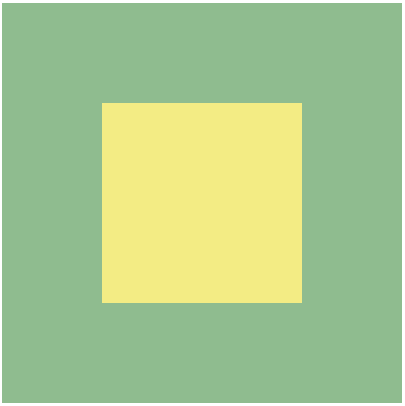
方法一:父元素: display: flex; + 子元素:margin: auto;
适用于有宽高的盒子
1
2
3
| <div class="big-box">
<div class="inner-box"></div>
</div>
|
1
2
3
4
5
6
7
8
9
10
11
12
13
| .big-box {
width: 400px;
height: 400px;
background-color: darkseagreen;
display: flex;
}
.inner-box {
width: 200px;
height: 200px;
background-color: rgb(243, 236, 132);
margin: auto;
}
|
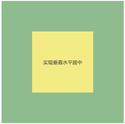
适用于文字内容所在的元素没有宽高
1
2
3
4
5
6
7
8
9
10
11
| .inner-box {
width: 200px;
height: 200px;
background-color: rgb(243, 236, 132);
margin: auto;
display: flex;
}
p {
color: #333;
margin: auto;
}
|
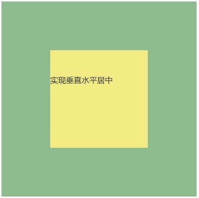
如果给文字内容所在p元素设置宽高,使用这个方法,文字就不居中了
1
2
3
4
5
6
7
8
9
10
11
12
13
| .inner-box {
width: 200px;
height: 200px;
background-color: rgb(243, 236, 132);
margin: auto;
display: flex;
}
p {
color: #333;
margin: auto;
width: 200px;
height: 100px;
}
|
inner-box 有宽高,显示如下图:
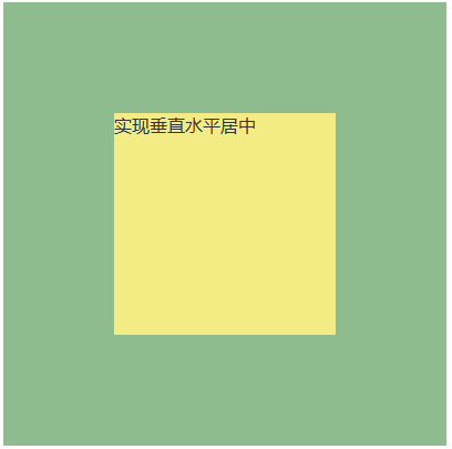
如果给文字内容所在p元素设置宽高,使用这个方法,文字就不居中了
1
2
3
4
5
6
7
8
9
10
11
12
13
| .inner-box {
/* width: 200px;
height: 200px; */
background-color: rgb(243, 236, 132);
margin: auto;
display: flex;
}
p {
color: #333;
margin: auto;
width: 200px;
height: 200px;
}
|
inner-box 没有宽高,显示如下图:
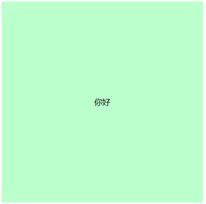
方法二:使用Flexbox(弹性布局)
1
2
3
4
5
| <div class="big-box">
<div class="inner-box">
你好
</div>
</div>
|
1
2
3
4
5
6
7
| .container {
height: 400px;
background-color: #bfc;
display: flex;
justify-content: center; /* 水平居中 */
align-items: center; /* 垂直居中 */
}
|
方法三:父元素:text-align: center;和line-height: *;
适用于内联元素,如文本或行内块元素。(文字内容所在盒子没有设置宽高的情况下。)
1
2
3
4
5
| <div class="big-box">
<div class="inner-box">
你好
</div>
</div>
|
1
2
3
4
5
6
7
| .big-box {
width: 400px;
height: 400px;
background-color: #bfc;
text-align: center;
line-height: 400px;
}
|
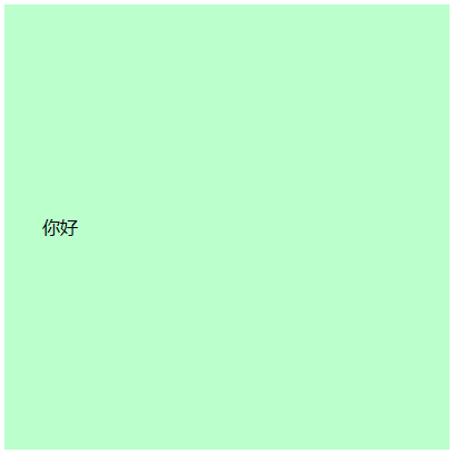
如果文字内容所在盒子有宽高,则不水平居中对齐。
1
2
3
4
| .inner-box {
width: 100px;
height: 100px;
}
|
方法四:使用Grid(网格布局)
1
2
3
4
5
6
7
| .big-box {
display: grid;
place-items: center; /* 同时实现水平和垂直居中 */
width: 400px;
height: 400px;
background-color: #bfc;
}
|
方法五:使用绝对定位
1
2
3
4
5
6
7
8
9
10
11
12
13
| .big-box {
position: relative;
width: 400px;
height: 400px;
background-color: #bfc;
}
.inner-box {
position: absolute;
top: 50%;
left: 50%;
transform: translate(-50%, -50%); /* 负的50%来实现水平和垂直居中 */
}
|
方法六:使用表格布局
1
2
3
4
5
6
7
8
9
10
11
12
| .big-box {
display: table;
width: 400px;
height: 400px;
background-color: #bfc;
}
.inner-box {
display: table-cell;
text-align: center; /* 水平居中 */
vertical-align: middle; /* 垂直居中 */
}
|