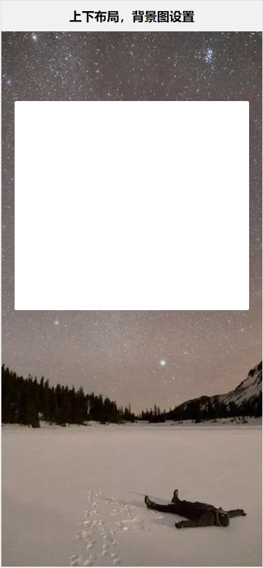
使用flex布局实现上下布局,整屏背景图设置—图片会变形
优点:铺满
缺点:图片变形
| 值 |
描述 |
| contain |
此时会保持图像的纵横比并将图像缩放成将适合背景定位区域的最大大小。 |
| cover |
此时会保持图像的纵横比并将图像缩放成将完全覆盖背景定位区域的最小大小。 |
注:使用 background-size: cover; ,背景图会根据屏幕高度铺满,图片会发生变形
1
2
3
4
5
6
7
8
9
10
11
12
| <meta name="viewport" content="width=device-width, initial-scale=1, maximum-scale=1, minimum-scale=1">
// 结构
<body>
<header>
<h1>上下布局,背景图设置</h1>
</header>
<div class="content">
<div class="form-box">
</div>
</div>
</body>
|
1
2
3
4
5
6
7
8
9
10
11
12
13
14
15
16
17
18
19
20
21
22
23
24
25
26
27
28
29
30
31
32
33
34
35
| // 样式
<style>
*{
padding: 0;
margin: 0;
}
html, body{
font-size: 0.13333333vw;
height: 100vh;
font-family: 'Microsoft YaHei';
}
body{
background-color: #f1f1f1;
display: flex;
flex-direction: column;
}
header{
height: 88rem;
line-height: 88rem;
text-align: center;
font-size: 18em;
}
.content{
flex: 1;
background: url(./images/pubuliu/24.jpg) center center no-repeat;
background-size: cover;
}
.form-box{
width: 90%;
margin: 200rem auto 0;
min-height: 600rem;
background-color: #fff;
border-radius: 5rem;
}
</style>
|
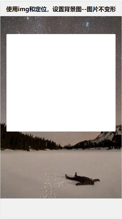
使用img和定位,设置背景图–图片不变形
优点:图片不 变形
缺点:不铺满
1
2
3
4
5
6
7
8
9
10
11
| // 结构
<body>
<header>
<h1>使用img和定位,设置背景图--图片不变形</h1>
</header>
<img src="./images/pubuliu/24.jpg" alt="" class="bg">
<div class="content">
<div class="form-box">
</div>
</div>
</body>
|
1
2
3
4
5
6
7
8
9
10
11
12
13
14
15
16
17
18
19
20
21
22
23
24
25
26
27
28
29
30
31
32
33
34
| // 样式
<style>
*{
padding: 0;
margin: 0;
}
html, body{
font-size: 0.13333333vw;
height: 100vh;
font-family: 'Microsoft YaHei';
}
body{
background-color: #f1f1f1;
}
header{
height: 88rem;
line-height: 88rem;
text-align: center;
font-size: 18em;
}
.bg{
width: 100%;
}
.content{
position: absolute;
top: 200rem;
left: 5%;
z-index: 100;
width: 90%;
min-height: 600rem;
background-color: #fff;
border-radius: 5rem;
}
</style>
|
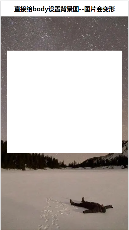
直接给body设置背景图–图片会变形
优点:铺满
缺点:图片变形
1
2
3
4
5
6
7
8
9
10
| // 结构
<body>
<header>
<h1>直接给body设置背景图--图片会变形</h1>
</header>
<div class="content">
<div class="form-box">
</div>
</div>
</body>
|
1
2
3
4
5
6
7
8
9
10
11
12
13
14
15
16
17
18
19
20
21
22
23
24
25
26
27
28
29
30
31
32
33
34
35
36
37
| // 样式
<style>
*{
padding: 0;
margin: 0;
}
html, body{
font-size: 0.13333333vw;
height: 100vh;
font-family: 'Microsoft YaHei';
}
body{
background-color: #f1f1f1;
background: url(./images/pubuliu/24.jpg) center center no-repeat;
background-size: cover;
padding-top: 88rem;
box-sizing: border-box;
}
header{
position: absolute;
top: 0;
left: 0;
width: 100%;
height: 88rem;
line-height: 88rem;
text-align: center;
font-size: 18em;
background-color: #fff;
}
.content{
margin: 200rem auto 0;
width: 90%;
min-height: 600rem;
background-color: #fff;
border-radius: 5rem;
}
</style>
|